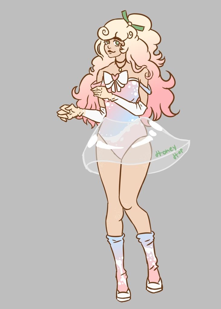
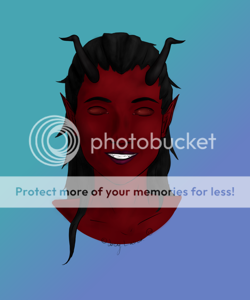
- Title: Hemlock 1
- Artist: Hemlock42
- Description:
- Date: 10/06/2010
- Tags: hemlock
- Report Post
Comments (3 Comments)
- IsaoShio - 10/06/2010
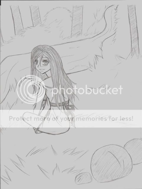
- I like how this one looks.Good job. It's a different take on the whole "Cinderella" concept. However, your shading does need some more editing. You should focus on allowing the shading to bring out the depth of the image. But as for the rest of it...it looks pretty good. The foot does seem a bit narrow and small. But I also know hands and feet can be difficult for people. Besides, I don't think this was done as a Realism piece. I hope this helps smile
- Report As Spam
- YellowYoYo - 10/06/2010
-
looks nice, but the shading's a bit smudgy and the unshod foot looks wrong
otherwise 4/5 stars - Report As Spam
- Edible Jazzy whore - 10/06/2010
- wow soo cool
- Report As Spam


