- by Sakurai Cherry |
- Painting And Drawing
- | Submitted on 03/23/2010 |
- Skip
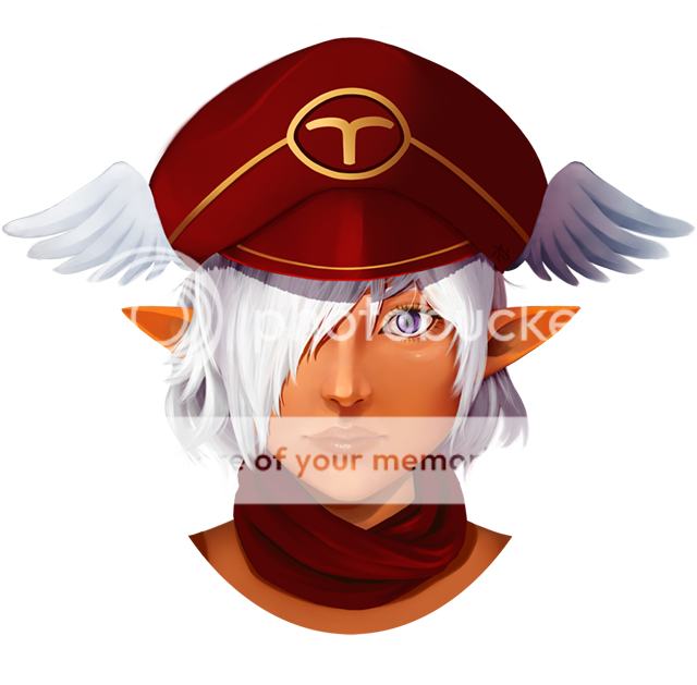
- Title: Cherry
- Artist: Sakurai Cherry
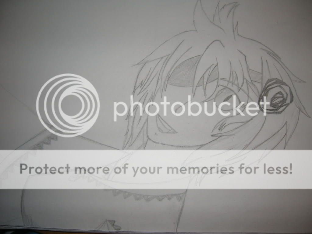
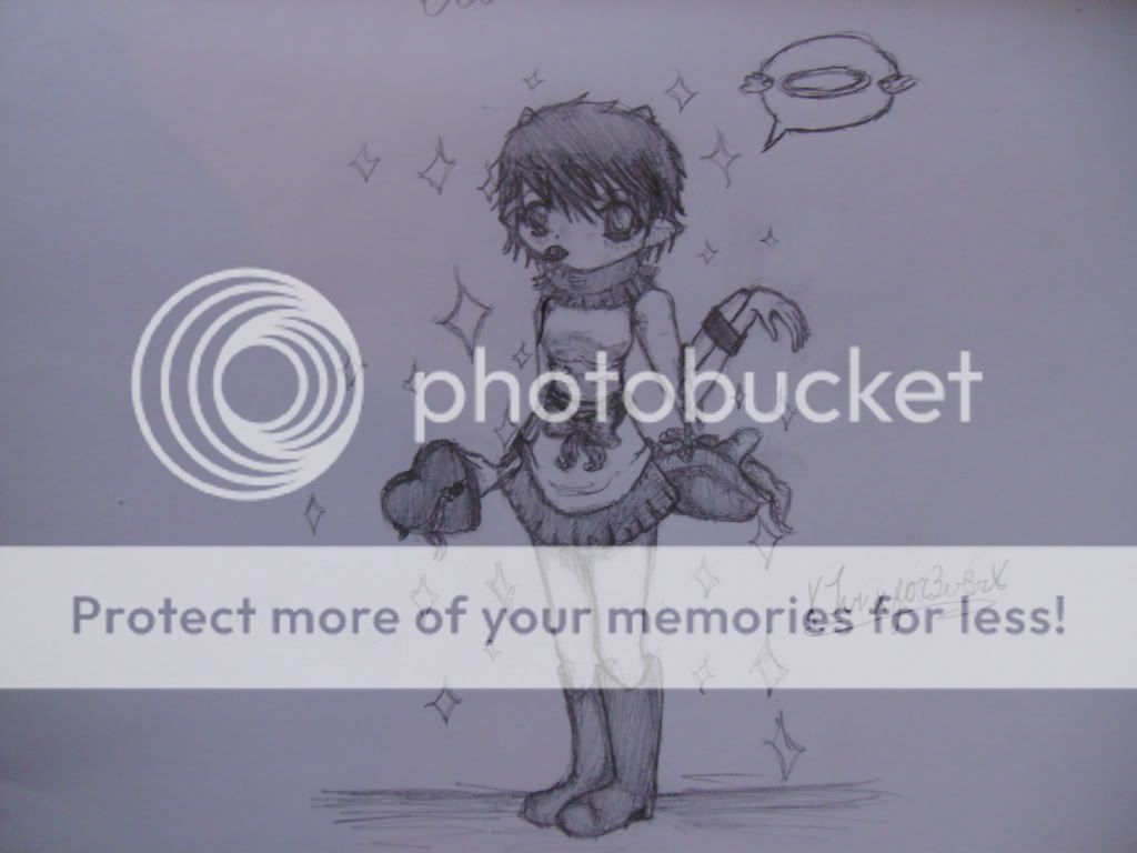
- Description: An avatar art I did for myself and my freebie thread. I know the butt looks a bit off, but other than that-- what else can I improve on? Please comment.
- Date: 03/23/2010
- Tags: cherry
- Report Post
Comments (3 Comments)
- AkyrosI - 07/28/2011
- Try to get those blades look sharper.. But yeah other than that. Quite good.
- Report As Spam
- Duzel_Enderlai - 03/24/2010
- Hm, well the chest is a little long in proportion to the head, and the joint in the arm at the elbow should be about where the belly button would be, or about where the hips start to branch out. Other than that its pretty good, nice job with the shading. 4/5
- Report As Spam
- Silently_Die_By_You - 03/23/2010
- you have amazing shading skills but suckish drawing skills. 3/5
- Report As Spam


