- by Syven Warsword |
- Painting And Drawing
- | Submitted on 07/22/2009 |
- Skip
Comments (7 Comments)
- Krasharkk Matsuki - 07/23/2009
- um, you suck at realistic art.but sont worry, i do too
- Report As Spam
- Phantom-of_Winter - 07/23/2009
-
-continuation 2-
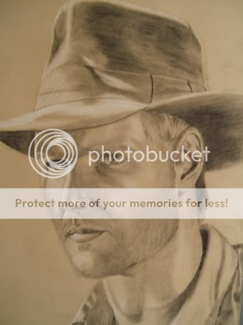
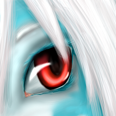
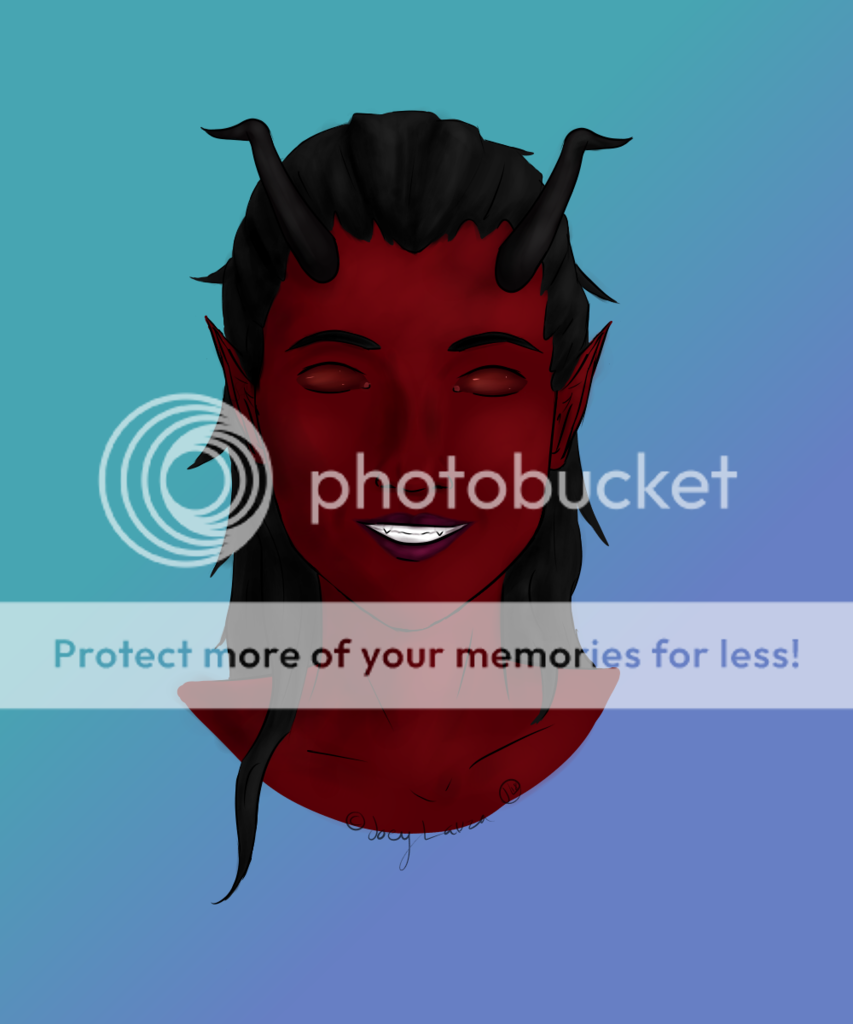
Only a couple of wrinkles should be shown in that area. And the last thing that bother me.. and it's probably the first thing I looked at was the bridge between the nose and the mouth. It is not only slanted but it might be too long for the face, just shorten it a little bit. Hopefully my critique would help you out with humanism in the near future. You should look at reference to help you with the eyes if you continue to have trouble shaping them. 3/5 - Report As Spam
- Phantom-of_Winter - 07/23/2009
-
-continuation-
And that goes for the pupil too. It's too lump sided and not a good circle. And make it a little smaller. Another thing; be careful of the eye measurements, the eyes are in two different spots. Now the eye brows... they should be curved along with the skin that is being "pinched" together, just to make the face angrier. Now going down, I don't know why you did more wrinkles on the nose (it looks too stastic). - Report As Spam
- Phantom-of_Winter - 07/23/2009
- Hmm... interesting. The eyes are one of the things that throws out the realism in the picture. The eyes look more cartoonish than humanism. For example, the eyes are too ovaled and the ends of the eye shouldn't be pointed (should be more curved). I see you show evidence of an oviduct on one side of both eyes, but not the other side. And you should make the eyeballs more rounds, instead of going with the flow with the rest of the eye.
- Report As Spam
- prinnce devitt - 07/22/2009
-
srry my other account cena_punk34
rate her/my art plaese. - Report As Spam
- prinnce devitt - 07/22/2009
-
wow that cool i couldnt do any better
hey when u get the chance can u rate my art please.
and a 5/5 - Report As Spam
- Leudwig - 07/22/2009
- LOL. It made me do a double take. 5/5
- Report As Spam


