- by gud_at_drawding |
- Painting And Drawing
- | Submitted on 02/16/2009 |
- Skip
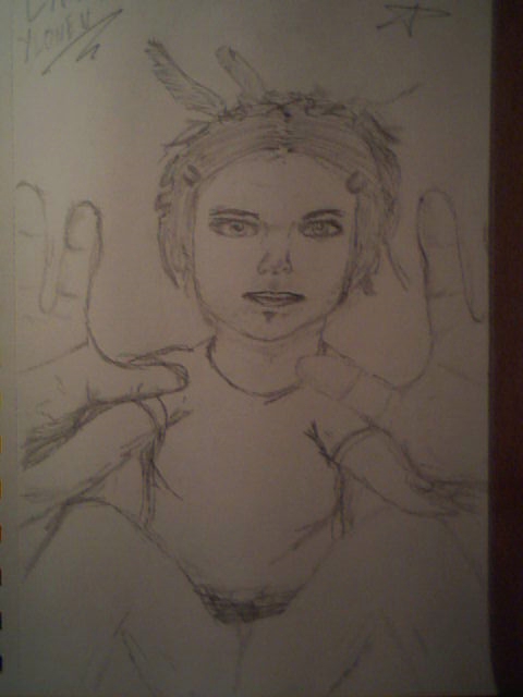
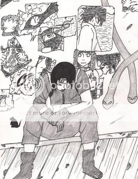
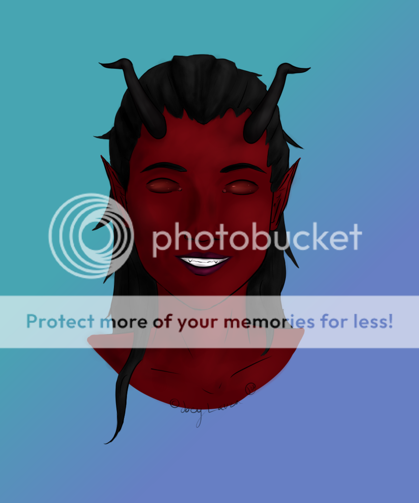
- Title: creepy 2.0
- Artist: gud_at_drawding
- Description: its weird, creepy and has 4 spines....................enjoy i ran out of room on the paper
- Date: 02/16/2009
- Tags: creepy
- Report Post
Comments (7 Comments)
- Stone Temple Creep - 03/01/2009
-
Very nice.
My only complaints, are that some of the details are a little difficult to make out, especially below the what looks like the collar bone area. I would try to find was to put more emphasis on the parts of the subject to set it appart from the background, especially if it's in b&w. Also, it's best to erase the pencil lines after it's been inked.
It's still quite awesome. You get my vote. - Report As Spam
- Wabbajacked - 02/19/2009
- eeeeeeeeekkkk its very scary!!!0.0 its gona get u
- Report As Spam
- BarbieMiii - 02/18/2009
- this is so kool my nephew said it is totally kool he said he would love to meet this persone that did this
- Report As Spam
- bencat - 02/18/2009
- i can only make out the head? but thts pretty good tbf
- Report As Spam
- x-Suicide Solution-x - 02/18/2009
- nice
- Report As Spam
- keithxxxd0pe - 02/17/2009
-
good 4/5
- Report As Spam
- catholic_demon - 02/17/2009
- i dont get how its weird and creepy .__.
- Report As Spam


