- by Hollywood Massacre Scene |
- Painting And Drawing
- | Submitted on 02/21/2009 |
- Skip
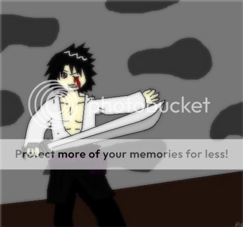
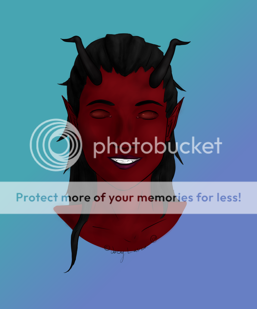
- Title: Cain
- Artist: Hollywood Massacre Scene
- Description: A drawing i did of a demon for artclass
- Date: 02/21/2009
- Tags: cain demon shirtless sexy
- Report Post
Comments (7 Comments)
- XxIzumeixX - 06/10/2009
- its really good, love the shadowing done. My only problem with it is the middle section is way to skinny for the rest of the body. If it is meant to be a starved demon, then you should make the hips/legs bigger to show that, right now it just looks like hes getting smaller. But its really good, and you should keep drawing for sure ^_^
- Report As Spam
- Hollywood Massacre Scene - 02/24/2009
- MFTRD is right though, Its meant to be distorted. but actually it is anatomically correct, it is in proportion its just the sides of the stomach are pulled inward much like that of a starved person. Im not bragging or anything but Im in anatomy and i know if something is anatomically correct or not. Look at a starved dead body of someone with alot of muscle the sides draw in much more than the anterior and posterior of the stomach do.
- Report As Spam
- awesome dragonslayer - 02/24/2009
- body is a no go but all in all its looks cool
- Report As Spam
- BoringLittleGirl - 02/24/2009
-
Its a demon.
it doesn't have to be anatomically correct. - Report As Spam
- Revolver Oshawott - 02/23/2009
- Not the point. The body ratio does not match. It is anatomically incorrect.
- Report As Spam
- Hollywood Massacre Scene - 02/22/2009
- supposed to be ridiculously skinny, with a prominence in the ribs.
- Report As Spam
- frogs-R-cool44 - 02/22/2009
- it's great but there's just one flaw, IT'S TOO SKINNY.
- Report As Spam


